Context study / VERSUM
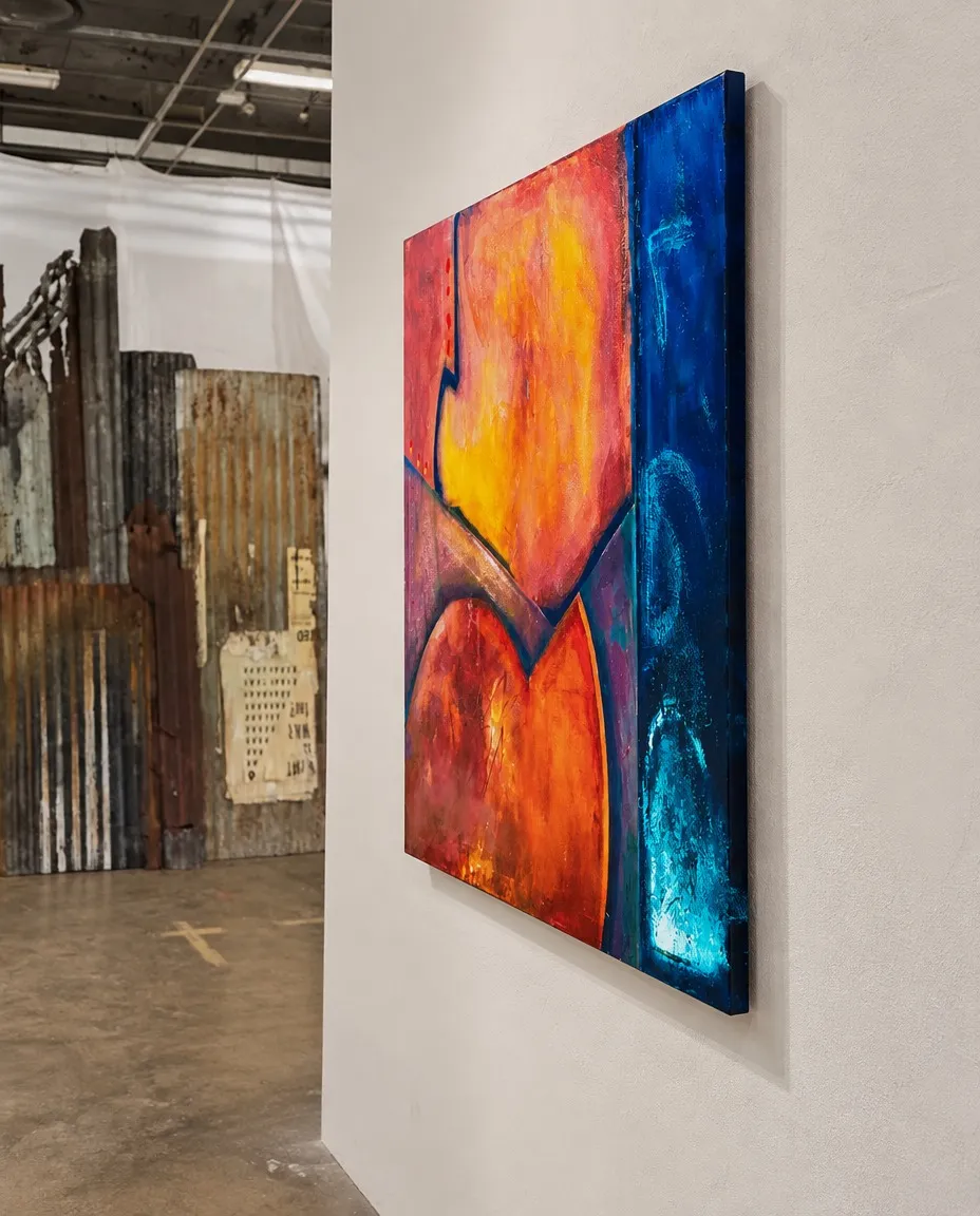
VERSUM – Abstract Painting by Maurizio Valch | VORTEX Series
Thermal Crossing Essay
One enters through the yellow, not through the painting as a whole. The yellow seems to be in a hurry: it pushes from within the orange, breaking through bright pinks and reds that have not yet settled. It does not warm gently. It behaves like matter seeking its place, as if it had grown too quickly and now needed to bend, compress, or find a way out. In the center, certain curves graze inclined planes; they do not allow themselves to be viewed as quiet figures. They barely hold themselves up, with the discomfort of something that does not yet know whether it will fall or keep moving forward.
As I approach this area, I notice that the more I try to recognize a shape, the more it slips away. I follow a dark curve with my gaze and realize I am not leading it: it leads me toward an unforeseen edge. I stand very close to the yellow, almost with the sensation that I could touch it, and then I perceive that the orange does not simply occupy a space: it insists, pushes, demands air. I do not know when a shape ceases to obey the person who painted it, but here I feel that one of them has already detached itself from me and continues to work alone.
The dark contours change the temperature immediately. They are not lines that explain where one zone ends and another begins. They seem like forces preventing complete expansion. That is where Antonin Artaud enters: he was a man of theater and thought who wanted art to stop being a comfortable explanation and to strike the body like a jolt. His presence does not ask what those curves represent; it asks where they create tension. A vertical line near the center tightens the jaw. A dark angle makes the breath grow shorter. A curve descending toward the red seems like a voiceless command: stop here, do not overflow, do not cross yet.
For a moment, this bodily intelligence believes it has found the answer. The blue strip on the right would be the wound cutting through the chromatic life of the center. All the heat would be trying to cross it: the yellow searching for a crack, the orange wanting to spill over, the red pushing as if it could reach the other side through sheer insistence. But the painting does not confirm this reading so quickly. Before deciding that the blue has come to interrupt something, it is worth lingering before it.
The band rises straight, dense, vertical. It does not offer itself as landscape, wall, or background. It has depth, but also surface; it has areas of turquoise brilliance that seem to come from within and others that seem stuck near the edge. Its blue does not simply cool the painting: it concentrates it. Beside it, the reds begin to seem more restless, less sovereign. The question changes direction: what part of this painting is trying to cross the blue band, and what part of us recoils upon reaching it?
Arvo Pärt is a composer who learned to make a few notes, separated by silence, seem to open up an immense space. From this attentive stance, the blue strip does not function as a rest after the fire. It is a pause that does not rest. A sustained note that carries weight. A silence with texture, thickness, and small glimmers that offer no relief. The blue does not arrive late to the painting: it was modifying the yellow from the very beginning, even if the gaze did not know it. Perhaps the warm center is not the living territory interrupted by a cold zone. Perhaps it is the noisy visitor in a room that already had its own breath.
Why does the yellow stay stuck to the edge and not go inside to live within the blue?
The question disarms an adult certainty: that of believing that colors, by being together, should mix or explain one another. Here, proximity does not produce agreement. The boundary between the orange and the blue seems more active than either of the two fields. It is not a clean separation; it is a graze. There is a narrow dark zone, an edge receiving pressure from both sides. Artaud, who had initially seen a wound, begins to listen. He no longer treats the blue as a pure cut: he perceives that it contains a vibration, that its silence also constricts the body. Pärt, in turn, admits the tremor: the luminous marks of the strip do not remain motionless; they seem agitated by something the heat has left nearby.
Now I look at the blue band without wanting to possess it. I step back a little from the painting and feel it moving further away from me. I do not recognize it as a negation or as an answer; I perceive it as a resistance that keeps changing place. When I return to the center, I can no longer think that the yellow rules the painting: I see it stopped by a distance I cannot measure. I am left with the impression that the finished work knows something I cannot bring close.
The return to the center is no longer a return to the initial heat. The large yellow seems less expansive because the blue strip has made its edge visible. The orange, once impetuous, seems held back by the dark contours; even the red at the bottom acquires a kind of caution, as if listening to something coming from the right. Artaud's old hypothesis does not disappear: one can still feel that one zone wants to cross into the other. But Pärt has inverted the pressure. Perhaps it is the blue silence that endures the invasion of the heat.
There remains, near the bottom of the band, a turquoise mark that refuses to be fixed. From afar it looks like a trapped light. Close up it looks like a scrape, a vibration, the remains of something that has just happened or has not yet begun. It does not belong entirely to the blue, but it does not surrender to the nearby fire either. It remains on the edge, working behind the eyes.
- Original artwork
- VERSUM
- Actual dimensions
- 39.4 × 47.2 in / 100 × 120 cm
- Presentation
- Digital contextual visualization
Context references
original abstract painting maurizio valch · warm tones and blue painting · original minimalist abstract art · contemporary abstract art decor · vortex series paintings valch · color field painting with textures
About this visualization
This visualization places the artwork within an architectural context to help collectors and viewers imagine its presence in a real space. It is an interpretive reference, not an exact reproduction: the original work remains the sole authority for scale, color, surface and material presence.