Context study / VERSUM
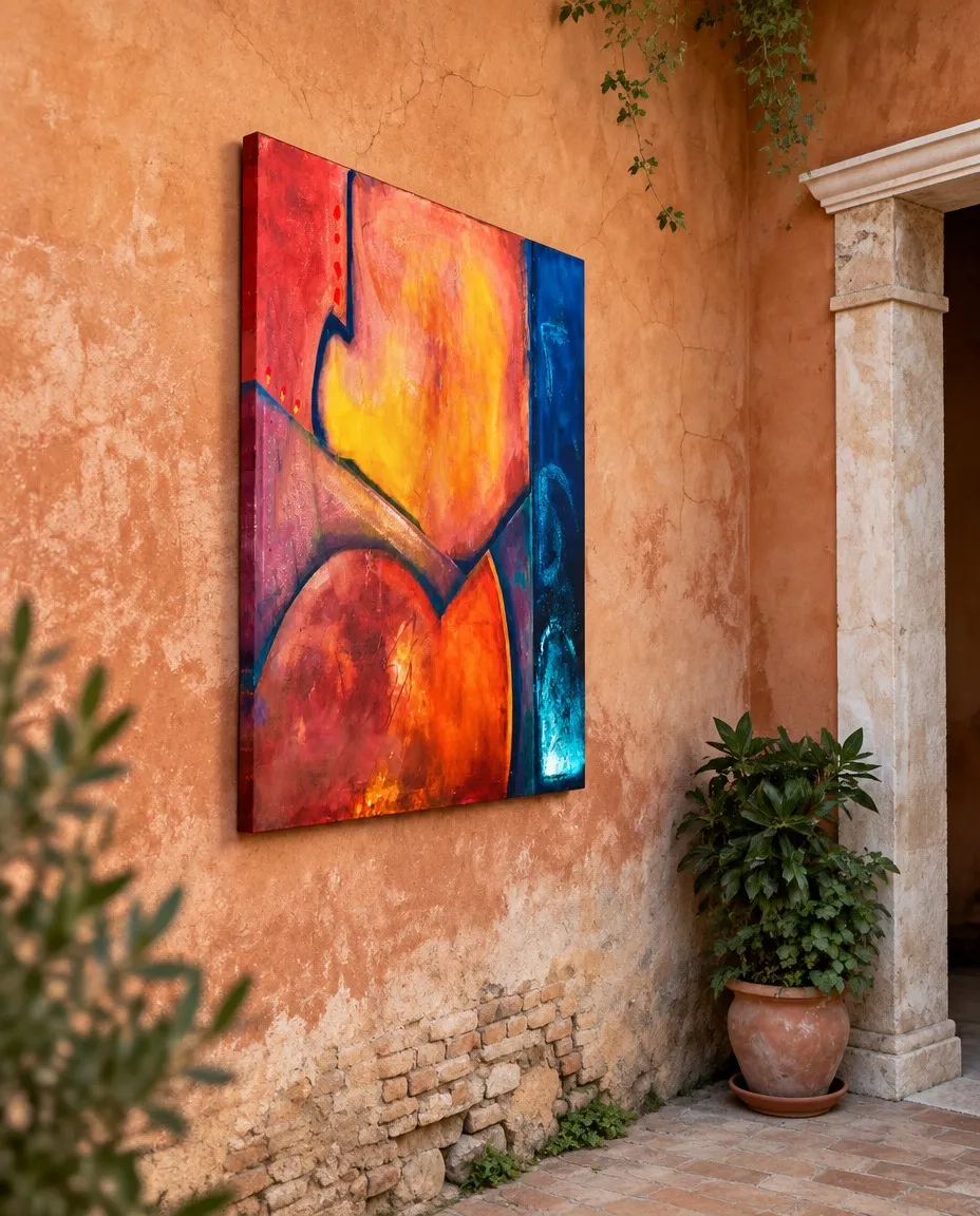
VERSUM Abstract Painting by Maurizio Valch in a Rustic Style Patio
VERSUM begins by pretending to possess a wall. On the right, the blue stripe—almost black in its deepest stretches—rises like a column that has decided not to belong to the rest of the painting. But it does not simply separate: it cools the nearby orange, sharpens the pinks, and exposes the yellow that seems to ignite in the center. The eye arrives first at the heat—to that mass of reds, corals, oranges, and yellows that swells, folds, and falls downward—but soon discovers it is looking under the lateral vigilance of the blue. There is no quiet background behind the warm zone. There is a margin that seems to be waiting for something from it, or holding it back. The question changes as soon as it begins: what does the warmth try to say before becoming illegible? Perhaps it does not try to say anything yet; perhaps it tries not to be interrupted.
Enter James Joyce. He was a writer who turned consciousness, language in motion, and ordinary experience into a territory of radical exploration. His intelligence does not ask to find a scene within the left zone, nor to translate its colors into a comfortable vocabulary of meanings. Rather, it suspects a warm sentence being built as it is read. The large central yellow does not illuminate a thing: it wavers, pushes, seeks air among the pinks. The lower curves do not describe a recognizable body, even if the eye, with its minor vices, immediately wants to find one; they function like a breath that has taken on volume. A dark line bends and cuts the field as if the sentence had swallowed hard. The red drops near the upper left edge are physical commas, small delays of a voice that does not yet know whether to continue or turn back. The stripes and contours do not decorate the surface: they mark where the chromatic matter loses the fluidity of its own impulse, where one association stumbles upon another and none manages to explain itself completely.
I look at the division between the warm and the cold and cannot sustain it for long. It seems to me that the image obeys me for an instant, as if I could keep each zone in its place, but immediately something shifts without moving: the yellow invades my attention, the blue hardens a curve, a line becomes closer than I wanted. For me, a painting stops obeying when I can no longer look at it as the sum of decisions that made it possible, and I have to accept that it returns a resistance of its own. I do not dominate it then; I barely accompany the way it withdraws from me.
The warm sentence continues, but its grammar does not progress from left to right. It descends. It plunges down a dark diagonal crossing from the middle zone toward the lower curves, and there it seems to find two masses that touch without merging: one redder, another of a brighter orange. The eye slides down this descent, almost with the uncomfortable speed of something about to fall, and stops because the blue edge calls to it again. That vertical column does a strange job: it denies the spill, but also makes it imaginable. Without it, the orange would be an expansion; next to it, it becomes an interrupted expansion. As if the painting were trying to keep a secret that is too hot inside a vertical refrigerator, and the refrigerator, far from cooling it completely, learned to glow with the heat it rejects.
Then enters Hannah Arendt. She was a thinker attentive to how we appear before others, how we begin something new, and how the common world can fracture or sustain us. Her arrival renders insufficient the freedom that Joyce could recognize in the chromatic sentence. Because a sentence that moves only within itself may be intense, but it does not necessarily have a world. The blue stripe forces us to ask about the conditions of appearance: before whom do these colors swell? What does that vertical, which seems so closed, receive? What fails to cross it? The blue can be a boundary, yes, but also a witness; it can be a wall, but a wall that has already seen too much to be called mute. Its darkness does not erase the warm zone: it places it under a form of exposure. Where the orange approaches, the margin seems to demand that it appear, that it be not only impulse or spilled intimacy.
The question is no longer just what the warm zone wants to say before becoming illegible. It is about whether anything can be said without accepting the risk of being received, misunderstood, contained, or expelled. The blue edge could be an archive of that which fails to escape; it could also be a public room where no one feels entirely safe. There are zones of blue that seem to have a clearer vibration inside, small luminous passages that do not offer themselves as consolation. They are visual traces, not of a verifiable history, but of a surface resisting pure closure. The column is not smooth to the gaze: it keeps accidents, variations, glints. That is why it is too poor to call it a limit. A limit without variations only prohibits; this one seems to listen and, in listening, alters what it contains.
I cannot decide that the blue is a barrier. It is more uncomfortable for me to think of it as a listening that does not promise shelter. I feel my painting tensing there: what seems separated may be attending, and what seems protected may remain exposed by that attention. For me, distance does not always separate; sometimes it prevents one form from devouring another. But I also distrust that distance when it becomes too perfect, when it seems to turn contact into an impossible rule. My doubt is not whether the blue lets things pass, but what happens to that which listens without being able to respond.
That doubt leaves Joyce and Arendt in disagreement, and the disagreement improves the vision. Joyce's intelligence would want to follow the curves like someone following a voice invented as it speaks: crossing the cuts, accepting the drift, allowing one stain to become the next without asking for documents. Arendt, on the other hand, asks what is lost if everything crosses, who is left without a place when there is no edge capable of sustaining a common appearance. For one gaze, the blue stripe offers the possibility that the warm zone does not dissolve into pure effusion. For the other, it threatens to freeze the sentence before it manages to speak its clumsy, urgent, magnificent confusion. Neither of the two gazes is enough. One fears confinement; the other fears fusion. Between both, the dark lines stop looking like mere cuts and acquire the more disturbing condition of a seam: they unite because they fail to close.
A childlike question disarms the solemnity of all this: “Why doesn't the blue spill over the orange if it's touching it?” It is not a small question. It forces one to look at the point where both fields approach, especially toward the lower half, where the dark diagonal seems to negotiate an encounter. Perhaps the blue does not spill because it is not on top of the orange, even if the gaze wants to imagine gravity. Perhaps neither is still, and the painting has stopped exactly at the instant prior to mixing. Or perhaps the edge has learned an absurd discipline: to remain next to what it desires without becoming what it desires. The eye draws near, imagining a rough surface, interrupted by visual glazes and zones of different apparent densities; it does not need to know how it was made to feel that the gaze cannot slide over it without stumbling.
Then a red drop returns near the top, small against the large lower masses. At first, it seemed like a minor punctuation, a sign that the warm field had overflowed a line. Now it seems to have learned something from the blue: it does not fall, it does not advance, it remains suspended next to the seam like a word that cannot cross to the margin. But the margin does not remain intact either. A few centimeters away, within the deep blue, a turquoise clarity seems to respond without responding, as if the cold had retained a tiny foreign ember. The gaze goes from one to the other, from the drop to the flash, and understands that the center was not in the yellow nor in the orange curves, but in that impossible touch: the red stopped in front of the blue column, both so close it almost seems the painting is about to change languages.
- Original artwork
- VERSUM
- Actual dimensions
- 39.4 × 47.2 in / 100 × 120 cm
- Presentation
- Digital contextual visualization
Context references
paintings for rustic outdoor patios · mediterranean outdoor decoration with art · abstract painting on clay walls · contemporary artworks for country houses · warm tones and blue stripe painting
About this visualization
This visualization places the artwork within an architectural context to help collectors and viewers imagine its presence in a real space. It is an interpretive reference, not an exact reproduction: the original work remains the sole authority for scale, color, surface and material presence.