Context study / VERSUM
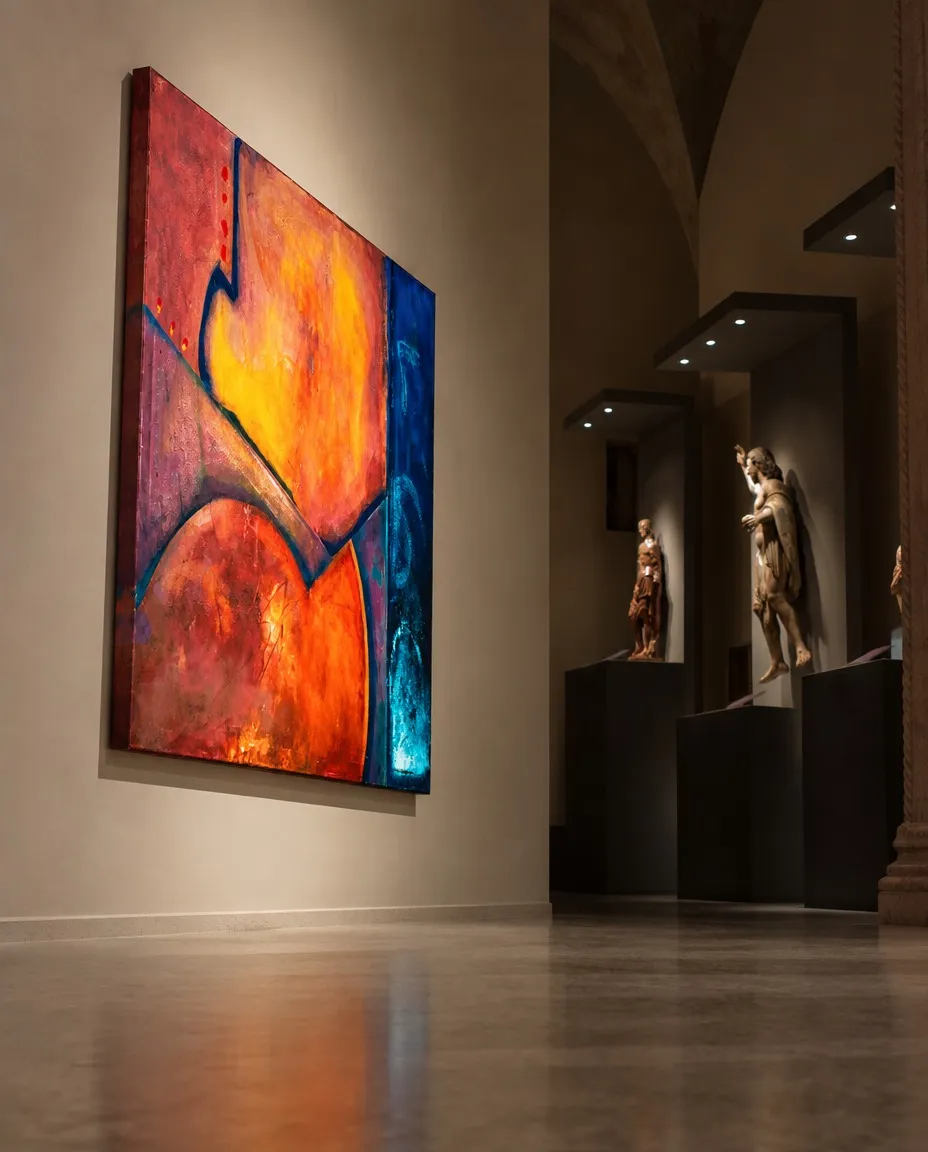
VERSUM by Maurizio Valch — Abstract Painting in Gallery Exhibition
Entry: The question does not yet fit within the painting
What does fire learn when a blue wall refuses to answer it in the same language?
Do not answer immediately. The painting is already busy responding in incompatible ways: a large warm expanse swells in the center and to the left, yellow to the point of almost hurting, orange, red, pink, grazing areas that seem to burn without consuming anything. The dark contours do not surround it calmly: they contain it the way one holds back a door being pushed from the other side.
On the right, the blue stripe does not keep company. It does not celebrate. It does not mix with the central fever to create a catalog peace. It remains vertical, deep, as if it had arrived from another hour and decided to stand while the rest of the surface heats up.
Johann Sebastian Bach matters here because he knew that a voice can change the meaning of another without touching it.
Listen first to the yellow-orange as a voice entering too early. Then, the low red: heavier, more earthly, almost round, as if it wanted to push from below. Then the dark diagonal: it appears as a bar, an edge, a gesture of order. Bach might try to distribute functions. This one sustains. That one responds. The other delays its arrival. The blue, then, would be the basso continuo: not a background, but a persistent presence that refuses to sing at the same temperature as the warm masses.
But the blue does not behave.
It returns different each time. At times it seems like a cold wall watching the fire. At times it seems like an opening through which the fire escapes without ever managing to leave. At times it is more like an ear: it does not listen from without, but from within the painting, with a slightly suspicious patience.
The large warm shape, on the other hand, has no patience. It expands. It retracts. It allows itself to be grazed by the dark boundaries and pushes them again. It seems to learn that burning is not just about expanding: it can also be about finding a resistance that does not melt.
I find myself before this surface as if before something that has acquired a will I cannot manage to translate. I recognize the tension between the warmth and the blue, but I cannot decide if one calls to the other or if both keep their distance. I look at the dark boundaries and feel they no longer obey my need to name them. I discover that the painting is finished when it stops explaining to me what I thought I recognized.
Interruption: Three drops, a broken scale
Near the upper left edge, small red drops descend.
Do not use them to decorate the reading. Do not dismiss them as detail. Draw close to them in your mind until the large yellow-orange field stops being large. Suddenly, those drops possess a strange gravity: they seem to have fallen, but they could also be rising; they could be a count, a delay, a small stuttering of color.
The painting, so vast a second before, now fits into the minimal space between one drop and the next.
A question of childlike intelligence interrupts the entire room: did the little red drops escape from the heat because the heat was squeezing them too hard?
It is an uncomfortable question because it does not know how to speak of composition, contrast, or balance. It asks with the logic of someone who still believes that a stain can get tired, hide, or call for help. And yet, it forces one to look at the dark contours in a different way. Perhaps they are not holding a shape: perhaps they are negotiating with it. Perhaps the shape is not a shape, but someone arriving late to their own edge.
The blue stripe reappears. It no longer seems just cold. Next to the drops, it seems to contain another scale of time: while the red descends in minimal impulses, the blue remains unhurried, as if it knew how to wait for a fall that never quite finishes happening.
Return, with a diagonal switching sides
At first, the dark diagonal could be read as a cut: a line separating two large regions and preventing the heat from invading everything. Then it seemed like support: the dark arm carrying a mass too luminous to stand on its own.
Now it changes.
The diagonal asks: who contains whom?
Does the line contain the hot field, or does the hot field force the line to exist? Does the blue limit the fire, or does the fire make the blue visible? It is enough to follow the slant of the cut to feel that it is not a stable boundary. The gaze descends along it and stumbles; it climbs back up and discovers that the edge is not an order but a discussion.
Bach might want to hear a precise relationship there: the return of a motif, a tension preparing another tension. But the painting sabotages the desire for resolution. Its repetitions do not return the same. The red at the bottom does not repeat the red at the top; it contradicts it with another density. The yellow does not illuminate in the same way as it approaches the contour. The blue does not always sustain: sometimes it seems to withdraw into itself, letting the warmth remain dangerously sure of its own importance.
And below, on the far right, appears that bluish light that does not quite belong to the stripe nor detach from it. It seems like a glow, but it does not behave like a response. It seems like a breath, but it breathes toward a place we do not see. It could be a tiny creature behind a blue door. It could be a reflection. It could be the zone where the painting decides not to obey our categories and just stays there, with an almost insolent calm.
A voice refuses to be filled in
Paulo Freire matters here because he does not let the gaze deposit answers into what it contemplates.
His interruption is not a polite objection. He asks who decides that the blue is a basso continuo and not an interlocutor; who calls a stripe "silence" because they fail to hear its language. Calling the blue "silence" can be comfortable: it allows the warm zones to go on speaking for everyone, with their grand gestures, their brilliance, their fire-like drama.
But the blue is there.
It does not ask permission to remain unheated.
Freire displaces the matrix question. It is no longer enough to ask what fire learns. We must ask what the viewer learns when discovering that they have been waiting for the blue to respond with a recognizable emotion, with a legible sentence, with a chromatic obedience. The blue wall does not answer in the language of fire; perhaps the problem is that the gaze had only brought one language.
Bach does not disappear. He insists that a question needs rhythm to avoid becoming an ornament. It returns: what does fire learn? It returns differently: what does the eye learn? It returns with a delay: what does blue learn from not being understood? Repetition, here, does not domesticate. It repeats so that the question loses its certainty.
A brief test, before the painting gets used to you
Mentally cover the blue stripe on the right for a few seconds. Do not cover the entire painting: only that deep vertical, with its low luminous zone.
Look at what remains.
The heat grows with excessive ease. The yellow-orange seems more central, more triumphant, almost too convinced of being the main event. The dark diagonal becomes less of a question and more of an edge. The red masses gather as if no one were going to dispute anything with them. Even the tiny red drops seem to be absorbed by a family too large, too sure that every red knows where it belongs.
Without the blue, something collapses: not the composition, but its resistance.
Now bring back the blue stripe.
It does not return as an optical addition. It returns as that which prevents the heat from declaring itself owner of the surface. The body also changes: the eyes stop pushing toward the center and learn to sustain two temperatures at once. It is no longer just a matter of looking at an opposition of colors; it is about enduring a presence remaining untranslated to reassure us.
I see that the blue zone does not return an explanation to me, but a question I cannot claim as mine. I can disagree with whoever hears it as support and whoever defends it as a voice, because I also perceive it as something looking back. I accept that the painting no longer belongs entirely to the intention that may have initiated it. I stand before that stripe as if before a boundary that does not close: it opens a fissure in the viewer.
Flight of attention
Go back to the low blue light. Now it seems less like an exception and more like a small disobedience within disobedience. Perhaps it keeps an escape route for the heat. Perhaps it is the place where the blue becomes porous. Perhaps it keeps nothing, and precisely because of that it makes us uncomfortable: because the gaze wants to turn it into an exit, a creature, a breath, a promise, and it refuses to choose a single mask.
The diagonal tenses again. It no longer simply divides the fields; it forces them to mishear each other. The large warm zones push from the left and the center, overheat, contradict each other, overlap. The blue remains on the right, but not motionless in the comfortable sense of the word. Its stillness works. Its apparent distance modifies the weight of each orange, the thickness of each red, the audacity of each dark edge.
Bach continues to search for relationships between voices, although he can no longer guarantee an architecture. Freire continues to ask about the agency of what we do not understand, although the rhythm of the painting reminds him that a question must return so as not to be forgotten. Neither wins. Better yet: neither manages to install themselves as owner of the listening.
And the red drops, near the upper left edge, no longer seem small.
They remain there: three or four minimal descents, learning to fall without completely abandoning the fire.
- Original artwork
- VERSUM
- Actual dimensions
- 39.4 × 47.2 in / 100 × 120 cm
- Presentation
- Digital contextual visualization
Context references
large abstract painting in gallery · large format contemporary painting · decorating with original art paintings · red and blue abstract artworks · maurizio valch abstract painting exhibition
About this visualization
This visualization places the artwork within an architectural context to help collectors and viewers imagine its presence in a real space. It is an interpretive reference, not an exact reproduction: the original work remains the sole authority for scale, color, surface and material presence.