Context study / VESTIGIA
VESTIGIA Red Abstract Painting - STRATA Series | Maurizio Valch
First strip: the red that holds
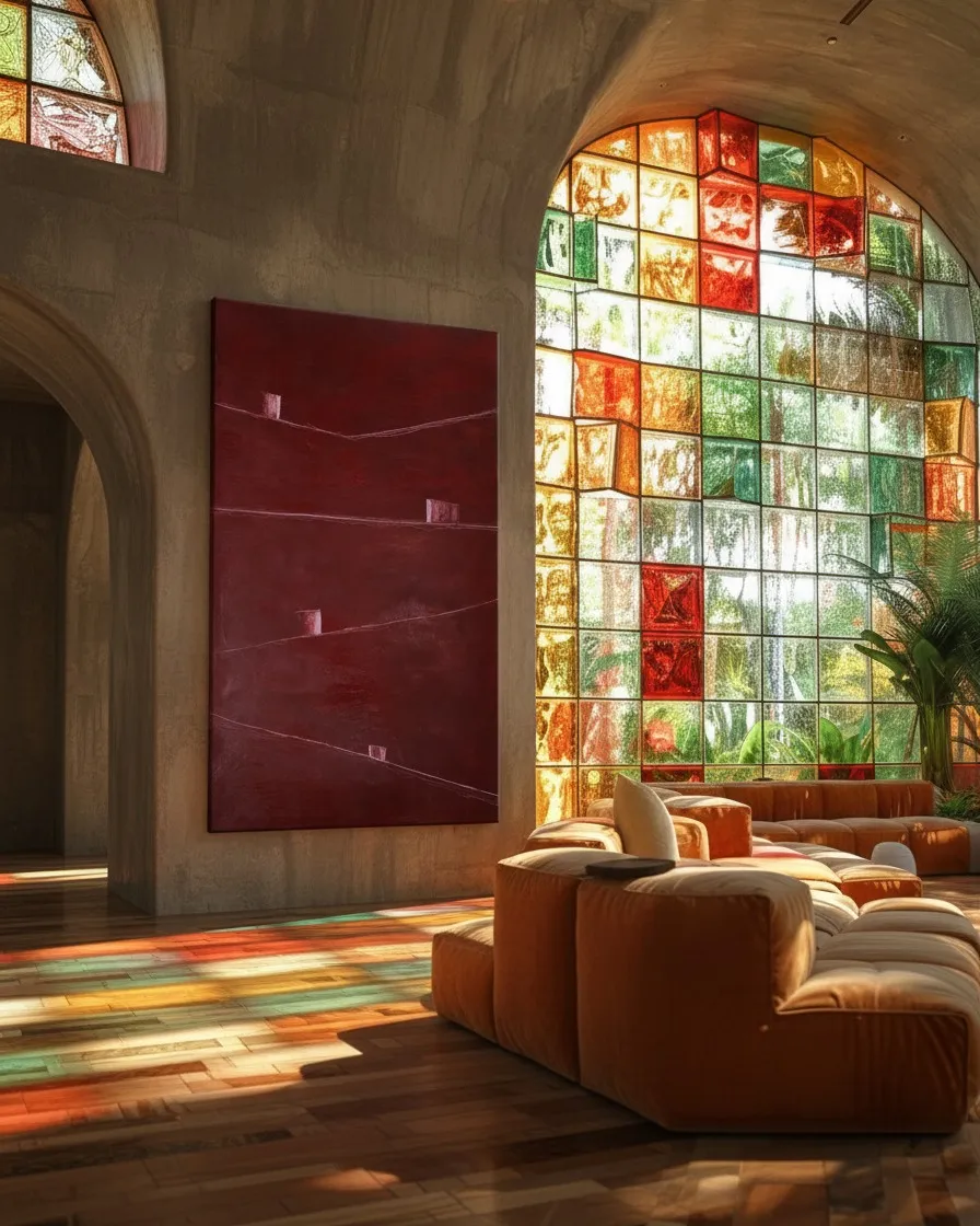
At a distance, VESTIGIA does not seem to open: it seems to keep. The wine-red, dark, earthy tone absorbs the gaze before returning anything to it. It is not a night nor a wall nor a field; it could be the surface of a place that has remained unnamed for too long. There is depth, but no bottom. There is matter, but no scene settles within it.
The first line crosses at the top, barely tilted. It does not hold the painting: it unbalances it. Rather than dividing the red, it leaves a fine pressure, as if something had passed through there and left a tension that has not yet finished cooling. Near that line, the first clear shape: small, rectangular, uncertain. It does not illuminate. It persists.
It seems like a minimal piece that received no instructions to belong to the space.
It could be a wall fragment.
A remnant of a window.
A small surface that refused to darken.
Nothing around confirms it. The red does not protect or reject it. It lets it be, with an almost mineral patience. And this presence, so sparse, forces us to measure everything else: the empty height, the distance to the edge, the silent weight falling below the line.
I do not know if that first mark is far away or too close. Sometimes the red seems to retreat and the shape remains suspended; other times the surface comes so close that there is no longer a landscape, only a pause. The painting ends when it stops obeying the expected distance.
Second strip: a small thing changes size
The second line descends slightly, and with it, the way of looking changes. It no longer seems like the sign of a division but a wavering edge. Its tilt is not enough to fall, but enough to prevent rest. Upon or beside it, another clarity appears, more compact, as if it had arrived late to a place that was already tilted.
Looking at it closely, the scale becomes disordered.
It is a refuge if the painting becomes vast.
It is an obstacle if the eye wants to cross.
It is a wound if the surface becomes skin.
It is a creature if the line begins to resemble a low breath.
Then enters Billie Holiday, a jazz singer whose voice made delay and heartbreak a truth of the body. She would not find a hidden melody here; she would find the moment before it. These lines would be places where a voice must decide whether to enter, to hold on, to break slightly, to let the air arrive first.
The second clear shape does not mark a beat: it interrupts it. It makes the line last differently. The gaze lingers when passing through it, just as breath stumbles upon something minimal before continuing.
A child's question suddenly sets in, too precise to push aside: “Why don't those little squares slide down the lines?”
Since then, the second presence can no longer be entirely a construction. It seems like a small stubbornness standing upright on a tilt. An interruption that has decided not to go along with the general movement. Or a scar that learned to sustain itself.
Instruction for viewing: follow the second line with your eyes from left to right, without lifting your gaze when you encounter the clear shape. Then repeat the path, but imagine that shape disappears. Without it, the line falls slightly more. Not much. Just enough for the body to notice it was balancing itself with something almost invisible.
Third strip: the beat and the leap
The third line arrives lower, less sure of being a line. It approaches the previous one, but does not repeat it. Between them remains a strip of red that seems to have duration: not empty space, but held time. Billie Holiday would return there, not to sing over it, but to listen to the instant when a note lingers so long that it ceases to be a note and becomes a weight in the throat.
The third clear shape is more exposed. Small, but alone. As if it had crossed part of the painting and stopped before reaching an edge. She would listen to it as a breath of air: brief, irregular, necessary. A place where the voice breaks not because it fails, but because it cannot continue to be smooth.
But Søren Kierkegaard was a philosopher attentive to the anxiety of choosing when no choice offers firm ground. For him, that third shape does not await an entry nor prolong a beat. It remains on the edge of a minuscule decision: to advance a fraction, to retreat a fraction, to stay where it is while the line continues to tilt below it.
Billie hears a delay. Kierkegaard sees a postponed choice.
She would say: do not hasten the fall, listen to how long it takes to occur.
He would reply: there is no fall yet; there is a suspended possibility that weighs more than the movement.
And the painting contradicts them both.
Because the mark is too small to become a destiny. Because it may be only a clarity adhered to the red, a difference in density, a minimal material obstinacy unwilling to dramatize itself. Not every pause belongs to a voice. Not every immobility prepares a leap.
From its friction remains a stranger, almost uncomfortable question: Can a trace have rhythm without belonging to anyone, and can a pause choose without having a will?
The third line does not answer. It just continues, with its slight tilt, crossing a territory that does not finish tilting with it.
Fourth strip: what remains between one mark and another
The last line is lower down, close to where the red becomes heavier. It does not seem to close anything. Its path has something of a late border, of an inscription that arrived when the painting had already learned to keep silent. Beside it is the fourth clear shape, perhaps the hardest to pin down: at times it seems a fragment ascending; at times, an absence that has taken shape.
It leads nowhere.
Yet, it alters the height of everything before it.
The four marks, now seen together, cease to be separate points. They form a sort of non-human breath: appearance, delay, inclination, retention. They do not advance in a row; they deviate. They do not occupy an architecture; they insinuate and abandon it. The red, which at first seemed a closed territory, begins to feel traversed by a minimal, almost clandestine activity.
I did not want those shapes to obey a single reading. Now they seem to know something I did not decide for them: that a light patch can stay still and, even so, displace the weight of the entire surface. Perhaps one of them is not stopped; perhaps it is waiting for the gaze to stop demanding a direction from it.
Billie Holiday would perhaps want to prolong the last line until the air ran out. Kierkegaard would perhaps ask the fourth shape to choose once and for all between holding on and falling. But none of those demands quite reaches its size. The mark remains too short, too concrete, too opaque to obey a voice or an idea.
And yet, looking again, something happens in the body: the first line seems to have descended slightly; the third, to have gained an inclination it did not have before. The fourth clear shape is no longer exactly where it seemed. It has moved without moving.
There remains between the lines a pause that belongs neither to the red nor to the marks.
A withdrawn zone.
As if the painting had hidden one of its traces just before the gaze could brush against it.
- Original artwork
- VESTIGIA
- Actual dimensions
- 31.5 × 47.2 in / 80 × 120 cm
- Presentation
- Digital contextual visualization
Context references
large red painting for living room · minimalist abstract painting · original Maurizio Valch artwork · contemporary wall art · elegant dark red painting
About this visualization
This visualization places the artwork within an architectural context to help collectors and viewers imagine its presence in a real space. It is an interpretive reference, not an exact reproduction: the original work remains the sole authority for scale, color, surface and material presence.