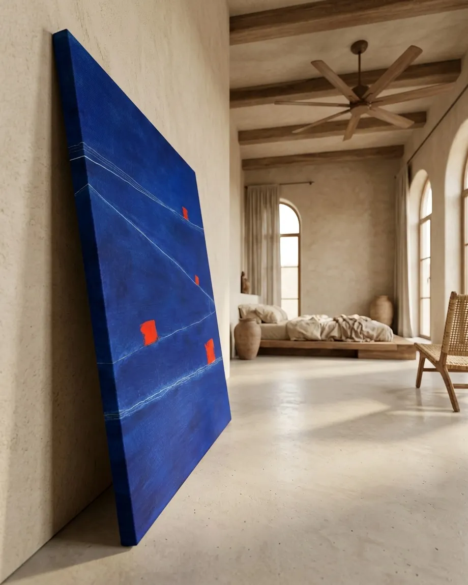
Context study / SUBMERSA
Minimalist Blue Painting SUBMERSA - Wabi-Sabi Bedroom Decor
First Approach: The Sign That Still Appears Alone
Begin by not calling the blue an ocean. For now, it is merely a vertical surface, 120 centimeters high: a field in front of the body, taller than an outstretched hand, narrow enough for the eye to believe it can encompass it and deep enough that it cannot do so all at once. There are pale lines crossing it with a fragile discipline. It is not yet known what they are. At times they seem almost still; at times they force the gaze to tilt, as if the blue possessed a secret slope.
The first red sign asks for no interpretation. It is far from the others, or so it seems at first: not because it occupies a precise edge, but because the blue between it and any company becomes vast. Small, red, slightly abrupt. It declares neither danger nor arrival. It simply interrupts.
Maria Montessori was an educator who learned to observe how learning is born when a person can touch, choose, repeat, and discover for themselves.
She does not propose that we explain the mark. She proposes something more uncomfortable: to look as someone looks who does not yet know that a line can be a landscape.
That someone would not say "there is an horizon." They would say: there is a pale thread moving. Nor would they say "there is a red figure." They would say: there is a thing that weighs differently. They would look at the distance between the red and the nearest line. They would measure without a ruler the blue gap remaining above, below, to the sides. They would bring their body close, then step back. They would discover that a minimal difference in height can change everything: a sign barely higher up is not simply higher up; it forces the eye to correct its way of traversing the field.
For Montessori, this first sign could be an orientation material without written instructions. A learning object that does not deliver the answer, but allows one to verify something: if the gaze passes too quickly, it loses it; if it insists, it notices that it is not as alone as it seemed. A pale, very fine line seems to graze its territory without touching it. Is it a relationship? Is it a miscalculation? Is it a repetition that almost coincides and then veers away?
I look at the finished work and can no longer entirely place where my decision begins and where the distance the lines have taken from one another starts. I see the red zones separate from me, acquiring a kind of quiet autonomy, as if they had found a position that does not need my permission. When I return to them, the surface seems less obedient than before: it does not return an intention to me, but a sustained doubt.
The first sign remains suspended between two possibilities. It might be afloat. It might be trapped. But those words are still too large for it. For now, it is enough to say that it has succeeded in making the blue stop being a background.
Second Approach: The Sign That Turns Blue into a Distance
If one looks again, the second red sign does not seem like a companion to the first. It seems like a problem of scale. There is something slightly ridiculous—and therefore moving—in its size against so much blue: a minimal, burning insistence that would have the insolence to pretend to orient an extension that does not allow itself to be dominated.
The gaze wants to unite it with the first. It wants to imagine a route between both. The pale lines offer partial help: one approaches, another departs, another seems to pass beneath the possibility of a path. For a few seconds, they serve as a trajectory. Then they fail. Not because they disappear, but because they do not fully accept becoming a direction.
This is where John of the Cross enters. He was a poet and mystic who explored darkness not as mere absence, but as an experience capable of transforming perception.
He does not easily concede that a sign leads to a discovery. He looks at the blue and withdraws comfortable words: there is no reason to call it sea, nor calm, nor night, nor spirit. It can simply be that which disorients because it has withdrawn habitual supports. A space with no visible ground. An immensity that does not promise to have been made to be crossed.
Montessori wants to compare the heights of the two signs, to notice which seems heavier, which remains closer to a line, which demands that the eye stop sooner. John of the Cross responds that comparison saves no one. A line can hint at an exit and yet lead nowhere. An orientation can be true even when it does not lead to a destination.
I do not say that lines can save me. Rather, I feel that when I follow them, my body leans toward a promise that never quite arrives. The blue does not let itself be possessed: it approaches and withdraws in the very same gaze. A red mark can accompany me and at the same time interrupt me, like a presence that prevents me from getting used to being alone within the surface.
The second sign modifies the question of the quest. It is no longer about finding out what the red things mean. It is about knowing what a gaze does when it discovers that perhaps none of them have been placed to guide it. The eye wants to obey them. They do not exactly refuse. Nor do they accept the responsibility.
And then the child's question appears, precise as a fingernail on a table:
Why do the lines pass so close to the reds without holding them by the hand?
After that question, the lines can no longer be simple divisions. Nor can the reds remain isolated points. Between each line and each sign, a scene of near-contact opens. Something approaches, but does not rescue. Something accompanies, but does not take.
Third Approach: The Sign That Seems to Get Its Place Wrong
The third sign occupies a less comfortable position. It does not let itself be looked at from afar in the same way. It is in a place where several tensions of the blue seem to cross, though perhaps it is only the eye that needs to invent a crossing. One line descends, another thins, another is lost for a moment in the surface. The red sign appears as a small objection: not against the entire blue, but against the idea that distances are clean.
Montessori returns here with a more concrete attention than that of John of the Cross. He speaks of walking without a guarantee; she points out that this sign is slightly lower than the gaze expected. Not much. Just enough for the body to make an imperceptible correction. If it were higher, it would belong to another zone of gravity. If it were smaller, it could be mistaken for a visual accident. If it were a little more to one side, the lines could leave it behind without anyone noticing.
That precision does not turn the work into a school exercise. On the contrary: it makes the experience stranger. The painting does not teach a lesson; it forces one to learn a type of attention that does not produce certainty. Montessori asks what kind of material this would be for someone who could not read instructions. Perhaps a tablet without letters, where one learns to distinguish between touching and reaching, between seeing a proximity and assuming a union.
John of the Cross is suspicious of that desire for verification. A difference in height can be exact and yet give no consolation. A deviation can be there to show that the world must not coincide with our measurements. But Montessori does not yield: that there is no consolation does not render the difference irrelevant. The solitude of a sign is not an abstraction if the eye feels it must descend to find it.
Here the blue has ceased to be a surface and has become an orientation test. It does not ask "do you understand?"; it asks "how do you maintain balance while looking?" The verticality of the work suddenly matters as a ladder that is not climbed matters: the eye ascends, slides, falls toward a line, rises again toward a red that was not where it seemed to be.
Perform a physical test. Detach your eyes from the painting for a few seconds. Look at a wall, a window, the floor. Return. Check if your breathing becomes a little slower or if your body leans slightly to one side. Ask what happens when the eye wants to follow a line and it refuses to become a path. There is no need to answer. It is enough to notice that the line has altered the scale between your body and those 80 centimeters of width.
The third sign no longer seems to be within a stable blue. It seems to force the blue to reorganize itself around it. It does not command, it does not reign, it does not symbolize. But it succeeds in giving immensity a stumbling point.
Fourth Approach: The Sign for Which There Is No Alphabet
The last sign does not fully accept translation. It may be closer to an edge, or a line, or a region where the blue seems to change in density; the important thing is that any sentence about it arrives too late. It can be called a sign, but even that word begins to feel too big or too small for it. We do not know if it indicates, if it resists, or if it simply remained there.
The other three had allowed for some operation: measuring a distance, following a detour, noticing a difference in scale, accepting an orientation without arrival. This fourth one does not let itself be used so easily. It does not seem to offer a point from which to order the others. It does something stranger: it returns uncertainty to everything that had already been learned.
Perhaps the blue does not contain the signs. Perhaps the blue occurs within them, as if each red carried a different amount of blue field around, above, behind it. The hypothesis is absurd for an instant. Then the gaze changes. The signs are no longer objects against a background; they are places where the background becomes incapable of remaining indifferent.
Montessori might want to get even closer: to check the exact separation between this sign and the line that seems to accompany it. John of the Cross might accept that proximity without promising it meaning. Neither resolves the other. She insists that a minimal deviation matters because it changes the body that looks. He insists that orientation is not annulled when it does not lead to a port, an explanation, or a home.
The disagreement leaves a new way of remaining before the painting. The pale lines, which at the beginning seemed to divide the blue, begin to look like that which prevents the four signs from being completely alone. They do not unite them entirely. They do not gather them. They pass close, they deviate, they fail with delicacy.
There remains, between the last red sign and a line that thins before reaching it, a blue strip that does not quite yield.
- Original artwork
- SUBMERSA
- Actual dimensions
- 31.5 × 47.2 in / 80 × 120 cm
- Presentation
- Digital contextual visualization
Context references
minimalist bedroom paintings · wabi sabi living room decor · mediterranean contemporary art · large cobalt blue paintings · modern rustic interior design
About this visualization
This visualization places the artwork within an architectural context to help collectors and viewers imagine its presence in a real space. It is an interpretive reference, not an exact reproduction: the original work remains the sole authority for scale, color, surface and material presence.